Our brand is not just a logo or other visual identity.
Brand is the personal connection and experience that people
associate with an organization - everything from the products and
services to customer service, marketing, and reputation. It's
important for everyone in Girl Scouts and Girl Scout - Diamonds -
staff, volunteers, and partners - to be consistent in how we present
Girl Scouts. Keeping our look, our messaging, and our identity
consistent safeguards and strengthens our overall brand.
When creating Girl Scout content and graphics, please follow the guidelines below. If you need assistance or have questions, please reach out to the communications team: online@girlscoutsdiamonds.org.
Brand Guidelines and Other Marketing Information
Important Reminders and Guidelines 
Trefoil and Council Servicemark
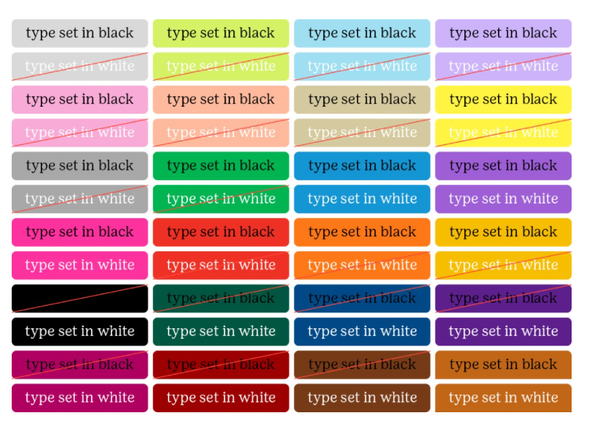
Colors and Fonts
T-shirts, patches and Other Branded Items
Language and Wording
Photography and Other Graphics
Social Media and Websites
Working with the Media
